You are using an out of date browser. It may not display this or other websites correctly.
You should upgrade or use an alternative browser.
You should upgrade or use an alternative browser.
Forum upgrade - information and queries.
- Thread starter adrian
- Start date
Pencarrow
Western Thunderer
Hi,
In cleaning up some of the navigation for "What's new" I've moved the link under the forum tab - if you use this link then I think the list it generates when you click on the thread title it should take you to the first unread post as it did in the previous incarnation. I still need to check why the button for "What's new" doesn't appear to work the same way but this is an alternative for the moment.
View attachment 154114
I'd appreciate it if you could test this route and let me know if it's working as expected. I've tested it but some times having an admin account I'm not always I see the same response as a regular user would.
Regards
Adrian
The What's New without the question mark in the shot below still takes you to the first post of a thread. Not sure why there's so many variations of What's New. The one with the question mark seems to be a list of unread and the other seems to be all recent posts.

michael080
Western Thunderer
Dog Star
Western Thunderer
Adrian (@adrian),
From the WT-home page, please select the "What's new" button (between the Recent Posts and Find buttons), then, in turn, try each of the following routes forward.
a/ Choosing the left hand "What is new" option gives un-read posts plus posts which I have read.
b/ Choosing the right hand "What is new" option gives only posts that I have not read.
Alternative b/ is my preference as this is the option which is closest to the previous WT function.
regards, Graham
Last edited:
SimonT
Western Thunderer
So it does, obvious really!Log Out seems to be in the drop down under your name
Making a quotation is slightly different. I used the " button and pasted the text into the quote box and then couldn't get out! I tried Ctrl, Esc, Tab and eventually escaped using the down arrow.
However, the upgade is a vast improvement, so thank you Adrian.
Simon
adrian
Flying Squad
So it does, obvious really!
Making a quotation is slightly different. I used the " button and pasted the text into the quote box and then couldn't get out! I tried Ctrl, Esc, Tab and eventually escaped using the down arrow.
However, the upgade is a vast improvement, so thank you Adrian.
Simon
Thanks for the feedback.
re quotes this problem on a tablet, phone or pc? When you say the " button is this the toolbar across the top of the editor? If I try your method on a PC then it automatically drops out of the box when I hi return.
As an alternative method can you try pasting the text first into the message, then highlight/select the bit you want as a quote and then press the " button. This I think should just put the quote box around the highlighted text.
SimonT
Western Thunderer
Adrian,
on a PC through DuckDuck/Firefox on Win10. The button was on this button line:

The second method was my preferred method on the previous version of WT. Trial.....

Thanks
Simon
on a PC through DuckDuck/Firefox on Win10. The button was on this button line:

The second method was my preferred method on the previous version of WT. Trial.....
Hitting Ctrl after the text is enveloped by the quote box results in the cursor leaving the quote box and the cursor moving to the next typing line after the quote box. Works for meAs an alternative method can you try pasting the text first into the message, then highlight/select the bit you want as a quote and then press the " button. This I think should just put the quote box around the highlighted text.

Thanks
Simon
adrian
Flying Squad
I posted a link earlier which works fine but in the post it is grey and sort of blends in with everything else.
Were the links blue on the old forum (I have forgotten already!)?
Rob
Thanks for spotting that, you are correct. It's to do with the "style" used, the old forum used a "flexile-2" style which helps it to be "flexible" for tablets and phones. However the "default style" in the new software is now flexible in the same way so I have stuck with the "default style"
I suspect that you are still using the "Flexile-2" style which looks like this
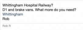
as opposed to the Default style which looks like this
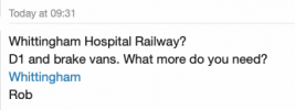
If you go to the bottom left of a page you can change the style, if you click on the style then it pops up a box where you can select "Default"

I hadn't realised that the upgrade had ported the old Flexile style across. I might turn it off so the it resorts to "Default" automatically.
adrian
Flying Squad
Hi,
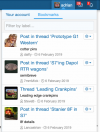
Latest update - the bookmarks should now be present and correct, they needed a manual import from the old system. They can be accessed from the tab next to your account details.
ignore the date in the list, it wasn't used in the old system so I just cut and pasted an arbitrary value to all existing entries. Any new bookmarks going forward should get the current date.

Heather Kay
Western Thunderer
That's bookmarks, which is a new one to me! What about threadmarks?
Some of us used them to let readers jump to specific parts of long build threads. They used to be accessed by a drop-down at the top of the first post.
Some of us used them to let readers jump to specific parts of long build threads. They used to be accessed by a drop-down at the top of the first post.
adrian
Flying Squad
That's bookmarks, which is a new one to me! What about threadmarks?
As mentioned yesterday it's on the todo list
Forum upgrade - information and queries.
Hi, My apologies for the delay - a slight last minute hiccup caused a slight delay. So the forum upgrade appears to have worked, Safari users should now be able to see embedded youTube videos. There a few differences in appearance with this new version but hopefully not too great. I'll post...
www.westernthunder.co.uk
Heather Kay
Western Thunderer
Cool. Thanks Adrian. I realised I sounded a bit grumpy when I hit the send button.


Dog Star
Western Thunderer
Now that you mention the facility... I have worked through the four options which are offered and I find default to be the least pleasant in appearance. I have selected flexile-2 as that seems, to me, to be a more friendly face for the forum rows and buttons as current.I hadn't realised that the upgrade had ported the old Flexile style across. I might turn it off so the it resorts to "Default" automatically.
adrian
Flying Squad
Now that you mention the facility... I have worked through the four options which are offered and I find default to be the least pleasant in appearance. I have selected flexile-2 as that seems, to me, to be a more friendly face for the forum rows and buttons as current.
Is it just the differences in the rows and buttons that make the difference? As mentioned in the square avatar thread maintaining multiple styles does add in a admin overhead and causes confusion. This being a case in point where the menu items in Flexile-2 are different to Default style and is causing confusion. I agree the menu arrangement works better in Flexile-2, those settings were imported across from the arrangement we had on the previous version and fully intend to update the Default style to match the Flexile pattern. It's another item on the todo list.
adrian
Flying Squad
If it doesn't currently then I can make it so. What file identifiers does the format use?Hi Adrian, @adrian , can the forum support the upload of Anyrail format files?
It also sounds like a potential candidate for a new feature I'm keen to try out so I might get back to you soon about them.

