TFW’s workshop

Tim Watson

Western Thunderer
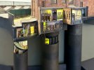
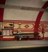
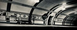
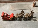
In December, the MRC usually holds a pre-Christmas mini exhibition. The York Road tube diorama was having its first outing with a working train for the show. Whilst certain features such as the toilets and occupants are popular with all ages, I thought it was appropriate that the younger members of the audience get a preview of Santa Claus and his reindeer on a flight test. Having spent far too many hours making the underground tube station I wanted something nice and simple. Osborn Models came up trumps with a nice little 3DP of Santa in his sleigh with four reindeer out front.
IMG_8930.jpg
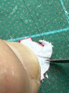
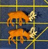
This had landed on the YR tube station roof and attracted many favourable comments from the audience, not least Phil Parker from BRM who was surprised to see such a model on CF. In discussion, I indicated that I thought it was capable of improvement, especially in the motive power department; CF is, after all, 2mm FS. Close examination reveals that the antlers and heads of the ‘reindeer’ pass a strong resemblance to a love child of a triceratops and a moose. There could be a case for an after-market bespoke antler etch if someone was very keen: I certainly didn’t fancy soldering up eight antlers from wire as an alternative. I then recollected that Preiser make some reindeer as a plastic moulding. Now these come as a very fine six pack in pairs, including four adorned with rather more plausible antlers. The challenge with these models was that they come in pairs and two of them would have looked as if Santa had done an emergency brake application with their heads down grazing. These therefore required plastic surgery with a triangular neck re-section.
IMG_8932.jpg
With the other pair I moved the head around on one of them to create a bit more variation. The Preiser reindeer are not too steady on their feet (maybe it’s not just carrots they have on Christmas Eve) and so some sort of location was required. A centre pole was made from metal strip and cross pieces of 0.4mm brass wire soldered in place. This replaced the chunky 3DP structure which was actually quite weak. At this stage the reindeer underwent key hole surgery with a 0.4mm tungsten carbide drill to locate the cross pieces just behind their withers. The antlers were also trimmed a bit.
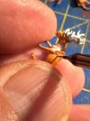
IMG_8933.jpg
After a fair bit of thinning down of the sleigh edges with a scalpel and very sharp chisel the whole assembly was given a puff of grey primer, to show any major defects.
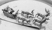
IMG_8935.jpg
At this point I had a serious look at reindeer liveries on-line. They are very similar to dairy shorthorn cattle with a mixture of beige, yellow ochre, umber & white. The antlers would generally be darker shades. The noses are generally pink and of course one of them (Rudolph) has a red nose. Any bridles / tackle were painted on with a fine brush. The parcel load in the sleigh was augmented with extras and some are carrying the initials of the grandchildren. The gold lining on the sleigh was re-instated using a fine line gold marker pen.
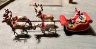
IMG_8949.jpg
Finally, I thought that the sleigh ought to carry some aircraft recognition marks for Lapland. These are OH-JLP. Those of you that know about these things will recognise that OH is the symbol for Finland and JLP is a shortened form of Joulopukki, Finnish for Santa Claus, or literally ‘Christmas Goat’. So now you know.
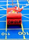
IMG_8937.jpg
Of course you could save yourself a great deal of work by purchasing a Modelu Santa & sleigh 3DP, which came out just as I started this project, but where’s the fun in that?

I look forward to seeing the grandchildren’s faces when they see Santa Claus on CF.


Tim
 

oldravendale

Western Thunderer
That is one of the most delightful modelling stories ever. Of course, the first iterations of the reindeer which were, in fairness, probably "adequate" for the sake of the story but they wouldn't do, would they? Brilliant stuff and I've enjoyed this more than anything else in the run up to..... I'll come back later, I just heard bells.:))
 

michael mott

Western Thunderer
Wow!! ……working between heartbeats, there seems to be no limits to what is possible once you become inspired, the picture of him holding up the needle puts it all in perspective.
Michael
 

Tim Watson

Western Thunderer
That is altogether in another league, Michael, but I find that I do control my breathing when doing very fine lettering.

Tim
 

Tim Watson
Western Thunderer
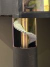
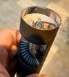
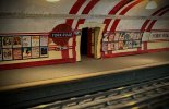
York Road spiral stairs are now complete, after a couple of weeks work: the illuminated steps will help to draw attention to the lift and give a raison d’être for the funny shape on the southern side of the tube station.
IMG_8982.jpg

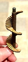
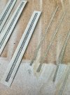
The construction was aided by John Jesson producing laser cut step sections using the MRC laser-cutting facility; rather like a castle stairway (the top step shows the profile).
IMG_8959.jpg

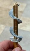
Once glued together, the centre section was cut away, the steps trimmed with a high speed tungsten carbide trimmer and a new brass ventilation shaft turned up to the correct diameter, complete with plate work jounts scribed into place. The aluminium collar helps to centralise and support the stairs towards the bottom. The reason for the polished conical tip will become apparent later (it’s not an ICBM).
IMG_8961.jpg

The copper pipe of the stair shaft had a window cut into it using diamond discs and the position of the stairs was then determined. IMG_8962.jpg
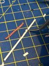
There are a number of conduits surrounding the ventilation shaft and these were represented by brass square section and strip. The vertical plate joints were scribed in using a tool in the lathe, where they would be conspicuous. IMG_8965.jpg
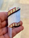
The artwork for the tiles was already available from the station building. Tile strips were cut out and thinned down from behind with a scalpel and tweezers so that they were almost like a transfer. IMG_8975.jpg
A paper liner was marked up and the individual tile patterns glued into place. I’m sure some clever person could have drawn all this up and printed it, but I’m more of a make it directly sort of person.IMG_8981.jpg

The liner was held in place with photo mount and a chrome metallic pen used to finish the top of the ventilation shaft cone and the top of the main shaft lining. Finally a light cured resin spherical lens was made to go on top of the cone. The reason for this? There is an LED positioned immediately above the main shaft in the roof and these reflective / refractive devices might capture and improve light transmission down the stairwell. I did not want to fiddle with extra LEDS. IMG_8987.jpg
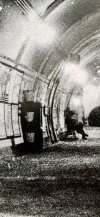
The final scene fulfils the aim we had three years ago of showing how a tube station is laid out. It’s not really realistic modelling, but I’ve found it great fun to do. IMG_8984.jpg
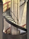
Just for completeness here is a
link showing the famous Covent Garden steps. https://preview.redd.it/iwl8o3d7eebb1.jpg?width=3024&format=pjpg&auto=webp&s=4d5f74c09a51902e8548e2fd49a23467d3bf2a61

I think that’s enough tube modelling for a while, apologies for the long post!

Tim
 
Last edited:

Tim Watson
Western Thunderer
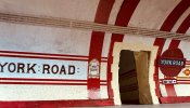
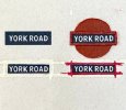
York Road now has its ‘modern’ signage and electrical conduits. It will be on display in diorama form at Ally Pally (16-17th March) on The Model Railway Club stand.
IMG_9200.jpg
The signs were printed (Ben Weiner made the artwork) and the edge mouldings on the name board were built up with paint.
IMG_9196.jpg
The signs were thinned down at the back by careful scraping with a #15 scalpel blade to make them less bulky.
IMG_9198.jpg
The conduits were laser cut as etched strips, by John Jesson, sprayed with white primer then given a wash of stone water-based colour.
IMG_9199.jpg
The station now needs loads of advertising signs, a couple of benches installing, a Nestle chocolate machine and fire buckets with a hose cabinet.

Tim
 

oldravendale

Western Thunderer
I'd love to see it, Tim, but I found the arrangements last year at Ally Pally abysmal so it's an experience I'll not repeat. I hope I'll have a chance to see York Road at another exhibition where the facility is better organised in the future.
Brian
 

Tim Watson

Western Thunderer
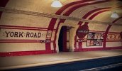
After some careful internet image acquisition & editing, York Road now has a full set of 1920s posters. A pile of fine ballast, bench, fire cabinet and buckets are still needed to replicate the prototype photo.IMG_9256.jpg

IMG_3775_oyFxbu7n9rGTzAuAbzJBmM.jpg
The images needed quite a bit of cleaning up and brightening before copying & pasting into the PowerPoint file. This software has a useful re-sizing capability and allowed mixing & matching of the posters for variety. The images were loaded onto a dark grey background and then printed at high resolution using an inkjet printer. The original PDF retains much of the resolution of the individual images which are degraded in the photo image. Commercial posters do not generally include the ‘local’ advertisements which are very characteristic of an area.
IMG_0741.jpg
The edges of the poster boards were touched in with a black pen. IMG_9243.jpg

The posters certainly add a splash of colour to the model and help with the atmosphere.
IMG_9256_2TYgwMWvyiGy3ybdLVMkKW.jpg

Tim
 
Last edited:

Tim Watson

Western Thunderer
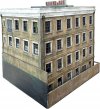
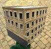
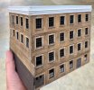
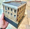
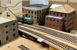
I have been working on this little project, in the background, over the last few weeks. It’s the first completed building for ‘Orchard Wharf’, The Model Railway Club’s new 4mm scale EM gauge layout. It will be on show at Ally Pally (16-17th March) as a work in progress.
IMG_9280.jpg
It was made from laser cut parts designed and produced by John Jesson, the layout leader. The MDF was primed with a white aerosol can before assembly.
IMG_9159.jpg
The structure was assembled, as provided, but it clearly needed a parapet.
IMG_9162.jpg
The parapet was made from styrene. It has a thin black styrene top layer which avoids white corners rubbing through when the building is handled.
IMG_9171.jpg
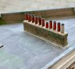
The flat roof needed some detailing with side drainage channels and a run of chimneys - the stacks are from Modelu, set into 5min epoxy flaunching. In this image the weathering is awaiting addition of dark green shading to represent wet areas with lichens.
IMG_9263.jpg
The drainage from the roof uses Modelu components.
IMG_9277.jpg
This is the building in situ.
IMG_9278.jpg
We will be running a building painting course at Keen House as there will clearly be a demand for it!

Tim
 

adrian

Flying Squad
The drainage from the roof uses Modelu components.
The parapet and the drainpipes look superb, a real solidity and look like cast iron units. However I'm still not convinced with the interlinked laser cut brickwork on the corners. There seems to be an awful lot of work to get them looking correct, I'm sure it's possible and looks absolutely fine normally but when the rest of the model has such fine details as the drainage downspouts and wall clamps the brickwork on the corner just jars a bit with the excessive mortar layer.
 

Tim Watson

Western Thunderer
The parapet and the drainpipes look superb, a real solidity and look like cast iron units. However I'm still not convinced with the interlinked laser cut brickwork on the corners. There seems to be an awful lot of work to get them looking correct, I'm sure it's possible and looks absolutely fine normally but when the rest of the model has such fine details as the drainage downspouts and wall clamps the brickwork on the corner just jars a bit with the excessive mortar layer.
I don’t disagree, Adrian. If you look at the first photo of the building on initial assembly you can see that the interlocking was much more apparent. It was then dressed with a file subsequently to improve it. My assembly was also a bit off, which shows in the close up photo at the top, with a joint that was opening a bit: I should have invested in some miniature sash clamps to hold it, but then early 19th C buildings are not always that solid after 120+ years. On the chimney stack it was made of solid wood and a thin laser cut layer pasted over it. That maybe works OK, but I was rushing to complete it on Friday.
IMG_9273.jpg
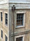
What that photo does show is the challenge of painting convincing flat roofs - it has dried out puddles and quite a lot of lichen growth to make it seem more natural. My experience of painting the MDF building is that it needs painting with a (white) primer to seal the surface otherwise it draws all the life out of the paint and is difficult to get the colour how you want it - especially on the burnt laser cut edges. You can nearly always tell if a model building is laser cut by the differences in paint colour on the edges.

As someone who has made probably more London buildings than most, the initial ‘kit’ didn’t look right so I got John to make the lintels for the windows. It originally had none and would have looked like a 1980s pastiche of a Regency building. Also, there is an inherent error in the design with all the windows of equal size, it would have been better with a gradation in size towards the top. It’s very easy to criticise though, and I find it much easier in 2mm scale, because people can barely see what you make…

Tim
 

jonte

Western Thunderer
I don’t disagree, Adrian. If you look at the first photo of the building on initial assembly you can see that the interlocking was much more apparent. It was then dressed with a file subsequently to improve it. My assembly was also a bit off, which shows in the close up photo at the top, with a joint that was opening a bit: I should have invested in some miniature sash clamps to hold it, but then early 19th C buildings are not always that solid after 120+ years. On the chimney stack it was made of solid wood and a thin laser cut layer pasted over it. That maybe works OK, but I was rushing to complete it on Friday.
View attachment 210701
What that photo does show is the challenge of painting convincing flat roofs - it has dried out puddles and quite a lot of lichen growth to make it seem more natural. My experience of painting the MDF building is that it needs painting with a (white) primer to seal the surface otherwise it draws all the life out of the paint and is difficult to get the colour how you want it - especially on the burnt laser cut edges. You can nearly always tell if a model building is laser cut by the differences in paint colour on the edges.

As someone who has made probably more London buildings than most, the initial ‘kit’ didn’t look right so I got John to make the lintels for the windows. It originally had none and would have looked like a 1980s pastiche of a Regency building. Also, there is an inherent error in the design with all the windows of equal size, it would have been better with a gradation in size towards the top. It’s very easy to criticise though, and I find it much easier in 2mm scale, because people can barely see what you make…

Tim
As a novice London building modeller, may I say that I’ll be more than happy if any of mine look half as good.

In particular, as far as my perusing goes, your attempt at replicating the hue of London brick looks spot on, to say nothing of the ‘flashing’ and flat-roof colours.

I gather from your latest posts that you’re extremely busy at present, Tim, but if you can spare a moment or two, would you be willing to share your paint types/colour mixes for each?

Whether or not, I hope there are more to come as they also give an idea of the most appropriate types of the myriad buildings trackside to choose, for the relatively tiny plots of real estate available to we space starved modellers, so that they don’t end up overpowering the scene.

Thanks.

Jon
 

Tim Watson

Western Thunderer
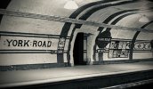
As can be seen in this YR photo the bench along the platform has a lady sitting on it.
IMG_9165.jpg

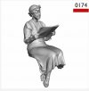
The bench was made a few weeks ago from modified Shire Scenes etches. I thought that the lady would best be served by this figure from Modelu

:IMG_0742.jpg

On arrival I was most impressed with the quality of the printing, especially the magazine. Unfortunately, once all the supports were removed I found that the lady had a rather extensive protuberance below her derrière. IMG_9282.jpg
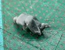
Trimming this away wrote off the magazine and, I’m afraid, the poor girl’s right arm. Even then she would not fit on the bench that I’d made, with her coy Princess Diana posture, and would look more like a child perching on the edge of a wall. Serious surgery was therefore contemplated. Those of a squeamish disposition should look away now.

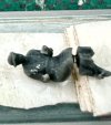
She was electively fractured just below the knees and placed on a thick sticky tape operating table for distraction therapy. IMG_9283.jpg


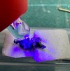
As this was judged to be about the correct length, a small amount of light cured adhesive was introduced into the fracture site and polymerised.

IMG_9284.jpg


After checking her against the bench the void was made up with more light curing resin added with a pin in small increments. IMG_9285_c3KQAyjL6bqMu5vCcdEL8s.jpg


During the same operation, a new light cured prosthetic right arm was made. After a rapid recovery and following a bit more minor corrective plastic surgery the lady was sprayed dark brown as a base colour and then painted with suitable acrylic wash colours. She is now reading the Daily Sketch, marvelling at the Flying Scotsman’s non-stop run to Edinburgh. Her newspaper was made from cigarette paper and held in place with varnish.

IMG_9297.jpg


The end result is one step closer to reproducing the B&W York Road photograph and, unlike many figures on model railways, she is sitting properly on the bench with her feet daintily touching the ground.
IMG_9301_muDQWAWiMv2bFErDQjXtkf.jpg
For all that I think I must be mad to have spent virtually a whole day working on this figure.

Tim
 
Last edited:

Yorkshire Dave

Western Thunderer
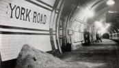
I think you may have to dim the station lighting to create a similar evocative atmosphere as portrayed in the original photograph.
 
Top